Learn the foundational principles of user experience design — from understanding user needs to creating intuitive interfaces — without needing a design background.
You can build the most technically impressive application in the world, and it will still fail if people cannot figure out how to use it. User experience — often abbreviated as UX — is the difference between a product people love and one they abandon after thirty seconds.
The good news? You do not need a design degree to build something people enjoy using. You just need to understand a few key principles and apply them consistently.
User experience is everything that affects how someone feels when they interact with your product. It includes:
UX is not just about making things "look pretty." A visually stunning application with confusing navigation has poor UX. A plain-looking application where everything is intuitive and fast has good UX.
The best products combine both — they look great and work effortlessly.
The single most important thing you can do for your product's UX is to understand who you are building for. Not "everyone." Not "people who need this." Specific, real people with specific, real problems.
Ask yourself these questions:
Create a simple user profile. Give them a name, an age, a job title. Write down their goals and frustrations. Keep this profile visible while you make design decisions. Every feature, every button, every piece of text should serve this person.
For example, if you are building a project management tool for freelance designers, your user profile might be:
Maya, 32, freelance graphic designer. She juggles five to eight client projects simultaneously. Her biggest frustration is losing track of deliverables and deadlines across scattered email threads and spreadsheets. She needs a simple way to see all her projects at a glance and know exactly what needs her attention today.
This profile changes how you design. You would prioritize a dashboard view over a detailed settings page. You would make adding tasks fast rather than feature-rich. You would optimize for scanning rather than deep reading.
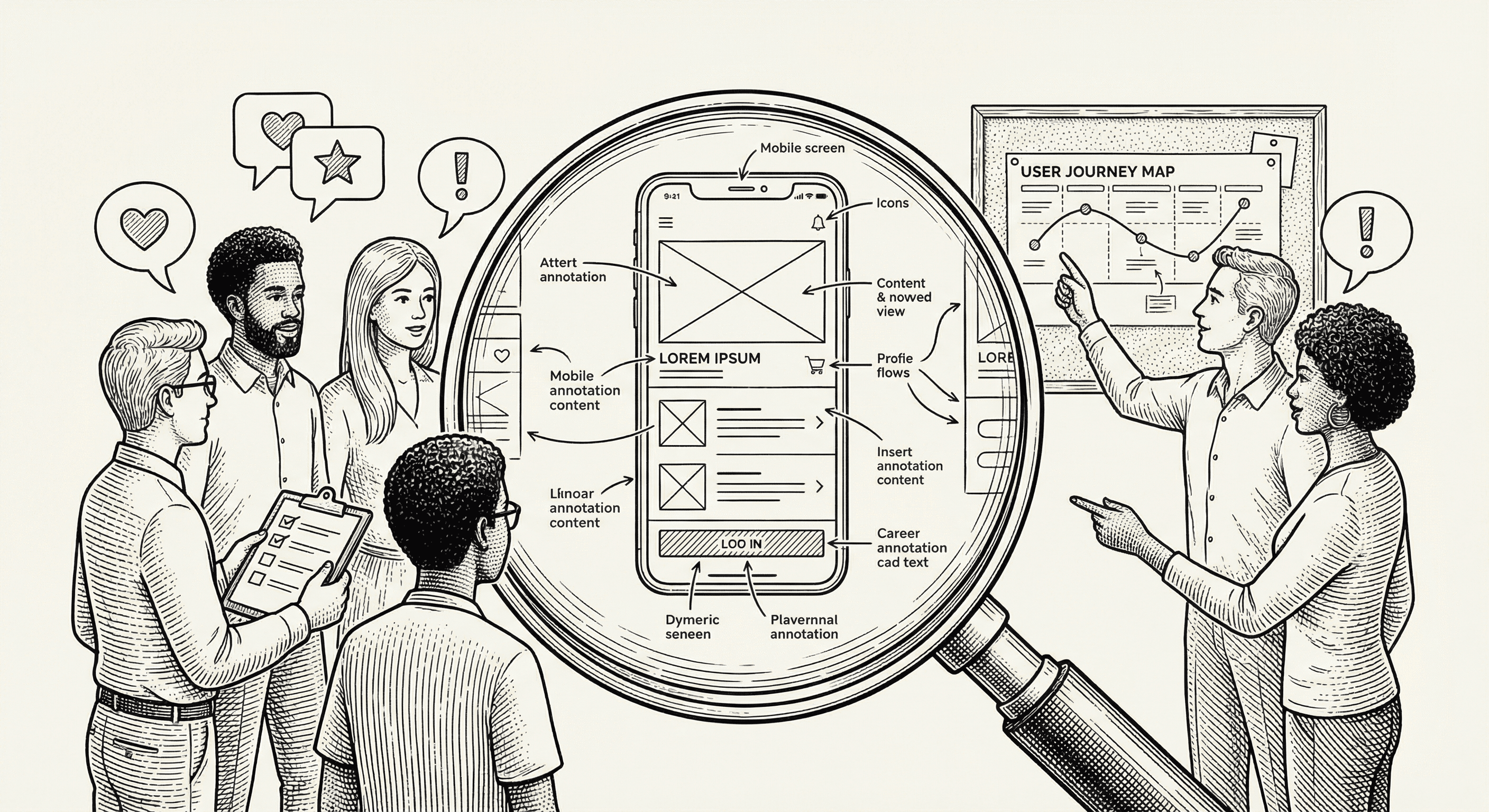
This principle comes from Steve Krug's famous book of the same name, and it is the single best heuristic for good UX: every page, every interaction, every element should be self-evident.
If someone has to stop and think about how to do something — where to click, what a label means, what will happen next — you have a UX problem.
Practical applications:
The critical path is the sequence of steps a user takes to accomplish their primary goal. For an e-commerce app, it is: browse → add to cart → checkout → confirm. For a project management tool, it is: create project → add tasks → track progress.
Your design should make the critical path as smooth and fast as possible. Everything else is secondary.
How to apply this:
Amazon discovered that every additional step in their checkout process reduced completed purchases by a measurable percentage. This insight led to one-click ordering — the ultimate critical path optimization.
People need to know that their actions had an effect. Without feedback, they are left wondering: Did that button click work? Is the page loading? Did my form submit?
Types of feedback to implement:
Good error messages are specific and helpful. "An error occurred" is useless. "Your password must be at least 8 characters" tells the user exactly what to fix.
Consistency means that the same element looks and behaves the same way everywhere in your application. If a blue button means "primary action" on one page, it should mean that on every page.
Areas to keep consistent:
This template helps with consistency out of the box. The design system (Tailwind CSS with configured tokens) provides a fixed set of colors, sizes, and spacing values. Using them consistently ensures your application feels cohesive.
Progressive disclosure means showing people only what they need at each moment, and revealing more as they need it. It is the antidote to overwhelming interfaces.
Instead of showing all settings on one massive page, group them into tabs or sections. Instead of showing every possible action on a card, show the basics and put advanced options in a dropdown menu. Instead of asking for twenty form fields up front, start with three and ask for more later.
Examples in practice:
The goal is to keep each screen simple and focused while still giving power users access to everything they need.
Accessibility means building your product so that everyone can use it, including people with disabilities. This is not optional — it is both a legal requirement in many jurisdictions and simply the right thing to do.
The good news is that accessible design is usually just good design:
This template includes accessibility features by default — semantic HTML, keyboard navigation support, and proper ARIA labels. Maintain these patterns as you build.
When you are making design decisions, run through this quick checklist:
You do not need to score perfectly on every point for every element. But consistently asking these questions will dramatically improve the quality of what you build.
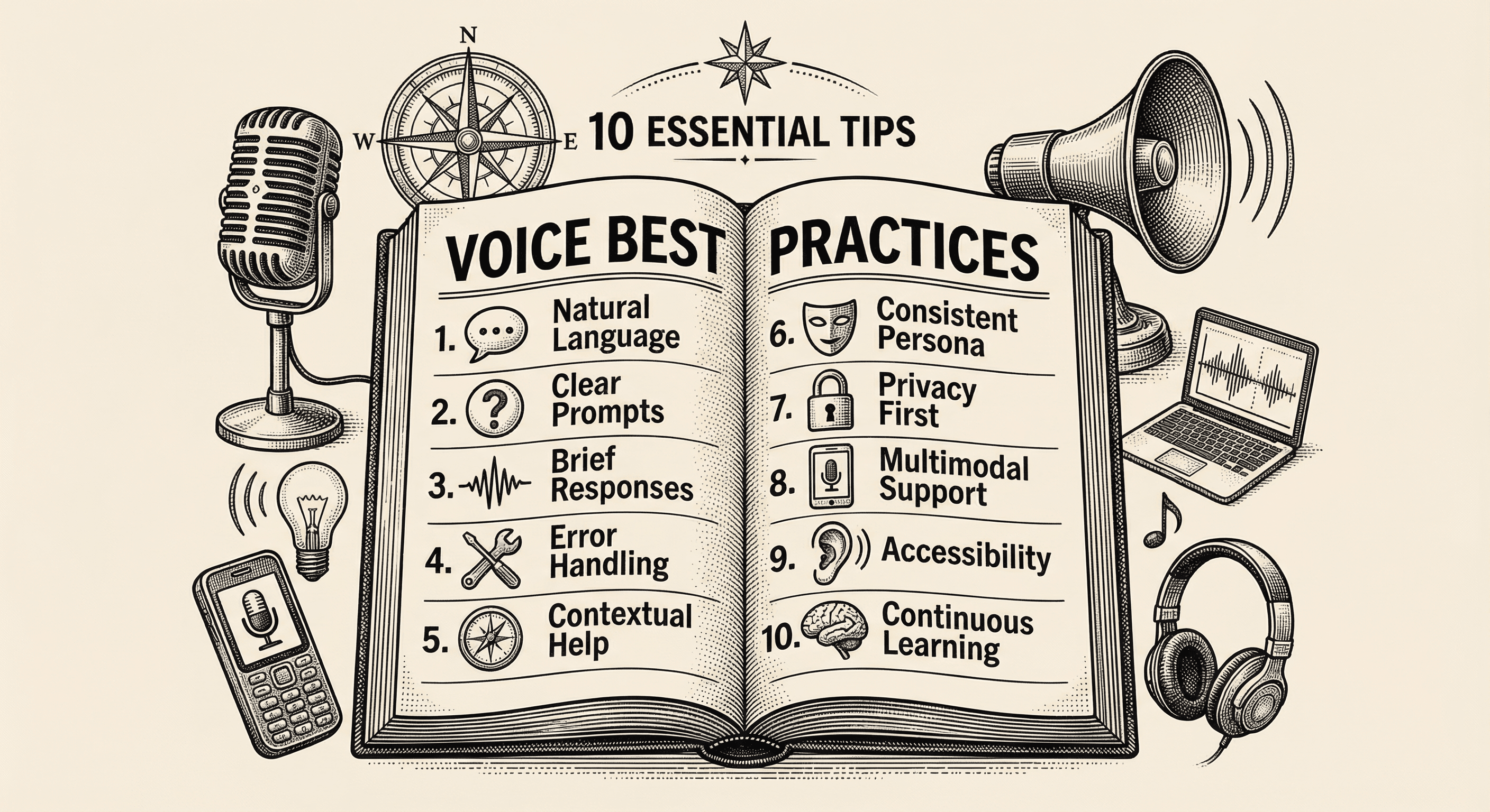
Practical, actionable advice for adding voice to your application the right way — from choosing the right moments to speak, to handling errors gracefully, to respecting your users' preferences.
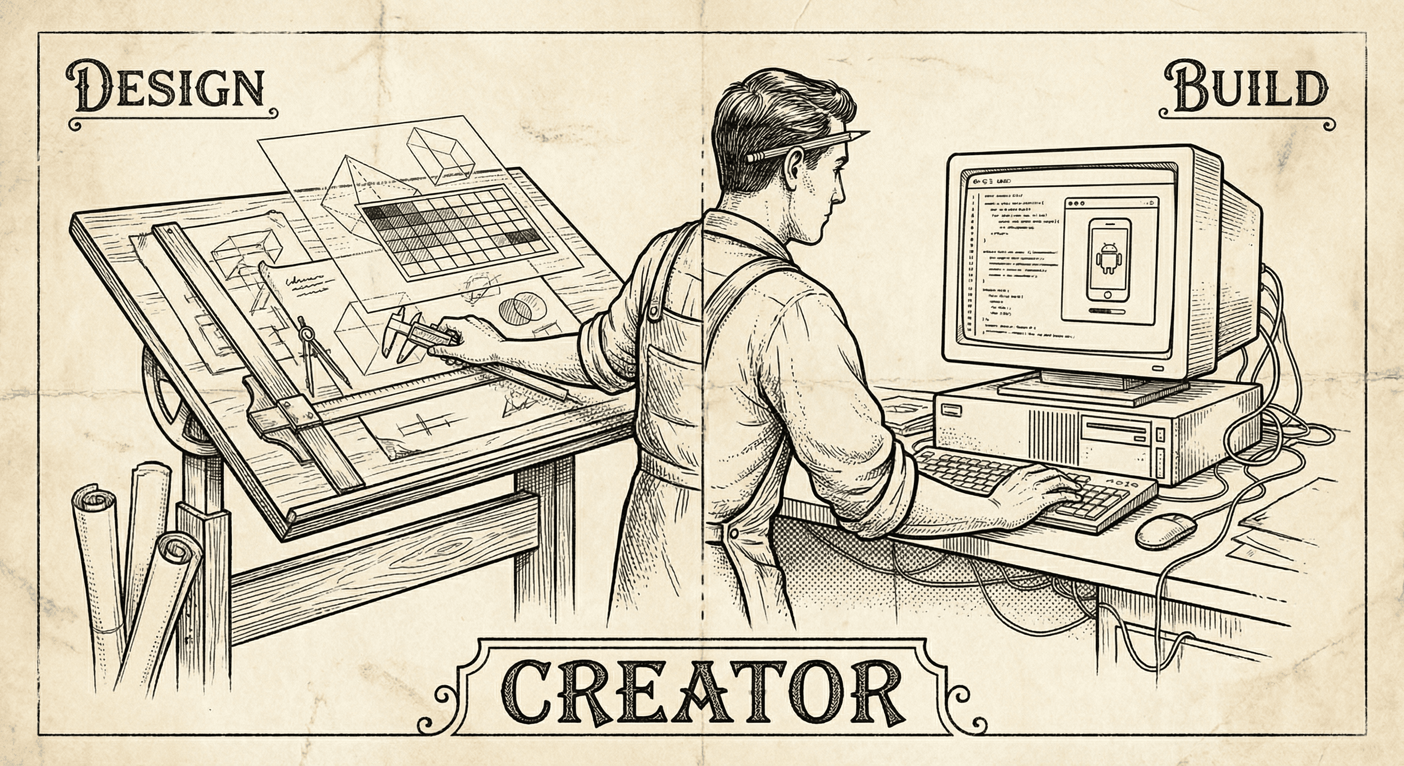
Designers have the taste, the empathy, and the vision. The missing piece is often the ability to ship. Here is why building — not just designing — is the next step, and how to start.